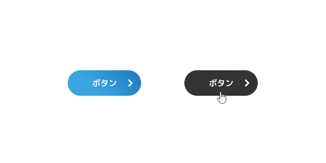
CSSのlinear-gradient()関数を用いることで画像を使わずとも、グラデーション色のボタンを作成することができます。
※矢印は、「Font Awesome」、文字はGoogle Fontsの「M PLUS Rounded 1c」を組み合わせております。
ボタンのイメージ
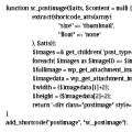
HTMLソース
<a class="button" href="#">ボタン <i class="fas fa-chevron-right"></i></a>
linear-gradient()関数でボタンを制作する際は、hover時にlinear-gradient()関数を使用せずに、background-color のみを指定するとhover時に色は変わりません。linear-gradient()は、image要素として扱われるため、background-image: none; を指定することでhover時はimageを非表示とすることで色を表現します。
CSS
.button {
  display: inline-block;
  position: relative;
  padding: .8rem 4rem;
  color: #FFF;
  border-radius: 10rem;
  background: -webkit-gradient(45deg, #2ca9e1 35%, #007bbb);
  background: linear-gradient(45deg, #2ca9e1 35%, #007bbb);
}
.button:hover {
  color: #FFF;
  background-color: #333;
  background-image: none;
}