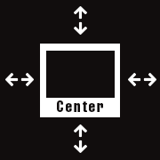
WEBデザインで画像やレイアウトした要素を中央に揃えるレイアウトを作ることがよくあります。実際にHTMLにコーディングをするときに、横位置をセンターにする場合や、縦位置をセンターにする場合などCSSだけで実現する方法をまとめてみました。
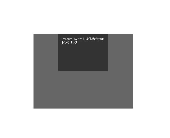
{ margin: 0 auto; } を使用した方法
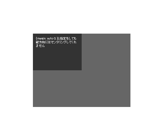
CSSを使い「margin: 0 auto;」という記述でボックス要素を横方向に中央寄せすることが一般的な手法になっています。
「margin: 0 auto;」で横方向のセンタリングが可能なら、「margin: auto 0;」で縦方向のセンタリングができそうですが縦方向はセンタリングになりません。
CSSで縦方向に中央寄せする方法をご紹介します。
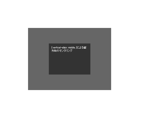
{ display: table-cell; } を使用した方法
親要素の「table-cell」化で「vertical-align」を有効にすることで縦方向の位置を調整することができます。
CSS
親要素の「div」に{ display: table-cell; }を指定すると、{ vertical-align: middle; }によって縦方向のセンタリングが可能になります。また横方法も{ text-align: center; }によって指定することができます。
ただし子要素はインライン要素である必要があるため{ display: inline-block; }を指定してインライン要素にしています。
{ text-align: center; }は子要素にも反映されるので子要素内で調整が必要になります。
div.container {
	display: table-cell;
	vertical-align: middle;
	text-align: center;
	width: 320px; height: 240px;
	background-color: #666;
}

div.container-in {
	display: inline-block;
	width: 160px; height: 120px;
	background-color: #333;
	text-align: left;
}
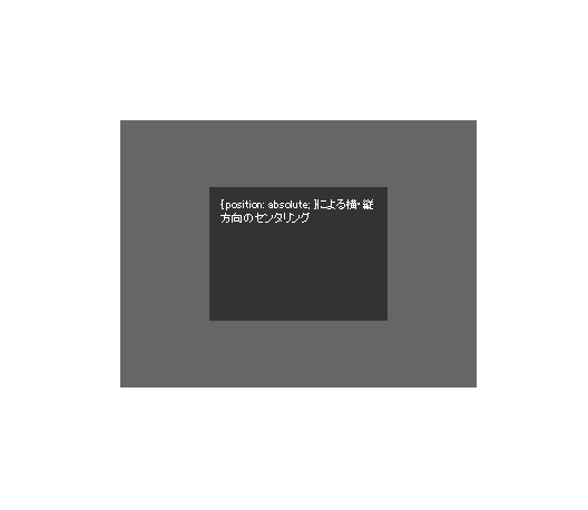
{ position: absolute; } を使用した方法-その1-
子要素を{ position: absolute; }として親要素からの縦横の位置を任意で設定することで、縦横のセンタリングが可能になります。
CSS
ポイントは子要素において全方向「top: 0; left: 0; bottom: 0; right: 0;」の位置指定を行うことです。それぞれの値が「0」でなくても同一値であればセンタリングになります。横方向にのみセンタリングを行う場合は「left: 0; right: 0;」、縦方向にのみセンタリングを行う場合は「top: 0; bottom: 0;」をすることで位置を指定することができます。
.container {
	position: relative;
	width: 320px; height: 240px;
	background-color: #666;
}

.container-in {
	width: 160px; height: 120px;
	overflow: auto;
	margin: auto;
	position: absolute;
	top: 0; left: 0; bottom: 0; right: 0;
	background-color: #333;
}
{ position: absolute; } を使用した方法-その2-
「top」、「left」と「margin-top」、「margin-left」を組み合わせセンタリングを行います。「margin」をマイナス指定でずらすことで調整をしています。
CSS
.container {
	position: relative;
	width: 320px; height: 240px;
	background-color: #666;
}

.container-in {
	width: 160px; height: 120px;
	position: absolute;
	top: 50%;
	left: 50%;
	margin-top: -60px;   /* 要素の高さ ÷ 2 */
	margin-left: -80px;  /* 要素の横幅 ÷ 2 */
	background-color: #333;
}